The best calligraphy pen set for hand lettering depends on whether you want a forgiving brush pen, a crisp broad-edge nib, or a traditional dip pen: for most beginners, a mixed brush-pen set is the easiest starting point, while experienced artists usually gain more control from Pilot Parallel or a dip-nib set.
As an Amazon Associate we earn from qualifying purchases at no extra cost to you.

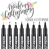
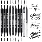

Our Top Picks
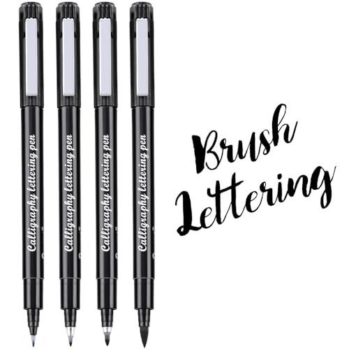
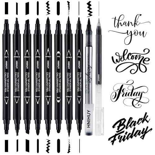

Top 3 picks at a glance
Quick picks by lettering style
| Best for | Recommended set or type | Nib style | Typical price range | Why choose it |
|---|---|---|---|---|
| First-time brush lettering | Tombow Fudenosuke 2-pack | Firm and soft brush tips | Usually $6–$12 | Simple pressure control and two useful flex levels |
| Colorful modern lettering | Tombow Dual Brush Pen starter sets | Flexible brush tip plus fine tip | Usually $15–$35 | Large color range and a fine tip for details |
| Italic, gothic, and broad-edge scripts | Pilot Parallel Pen set | Flat parallel-plate nib | Usually $25–$45 | Strong, consistent thick-and-thin contrast with refillable ink |
| Traditional pointed-pen lettering | Speedball calligraphy set with interchangeable nibs | Dip broad-edge and pointed nibs | Usually $15–$40 | Maximum variation in line, ink, and holder choices |
| Portable everyday practice | Kuretake ZIG Cartoonist or similar brush-pen set | Firm brush or felt brush tip | Usually $10–$25 | Quick setup, low mess, and compact storage |
What separates the best calligraphy pen sets for hand lettering?
Nib type and line contrast
Brush pens use a flexible synthetic tip. Pressing harder spreads the bristles and creates a downstroke; lifting pressure produces a narrow upstroke. This is the most intuitive format for modern brush lettering, but very soft tips can be difficult to control on small letters.
Firm brush pens, such as the Tombow Fudenosuke, offer less dramatic flex and are often better for beginners writing small words. Softer brush pens, including the brush end of Tombow Dual Brush Pens, create larger strokes and expressive flourishes but need smoother pressure changes.
Broad-edge pens have a flat nib that stays at a consistent angle. Pilot Parallel Pens use two closely spaced plates to deliver a steady ink supply, producing clean contrast in italic, uncial, and gothic-inspired lettering. They are less natural for bounce lettering because the nib is designed to maintain a structured angle.
Dip nibs provide the widest range. A pointed nib can make hairline upstrokes and flexible downstrokes, while a broad-edge nib produces architectural, uniform lettering. The trade-off is that you must choose and load the ink yourself.
Ink flow and drying behavior
A pen with strong flow is not automatically better. Wet ink makes dark, confident strokes, but it can feather on ordinary paper and lengthen drying time. Brush pens with water-based dye ink generally work best on smooth marker paper, layout paper, or dedicated lettering pads.
Pilot Parallel Pens use proprietary ink cartridges or a converter with suitable fountain-pen ink. Their feed can deliver more ink than a typical felt marker, which is useful for large letters but increases the risk of bleeding through thin paper.
Dip pens let you match ink to the surface. Sumi ink gives dense black lines, while many calligraphers use gouache diluted to a cream-like consistency for opaque color. Acrylic ink can work for specific projects, but it should not be allowed to dry in the nib because it can clog or damage the feed.
Head-to-head comparison
| Option | Flow consistency | Grip comfort | Refill cost | Practice tools included | Best skill level |
|---|---|---|---|---|---|
| Tombow Fudenosuke | Very consistent for short practice sessions | Thin, lightweight barrel; comfortable for most users | Low; replace the whole pen when the tip wears out | Usually no guide sheets | Beginner to intermediate |
| Tombow Dual Brush Pen | Good, though broad tips vary as they wear | Rounded barrel; can feel large in smaller hands | Moderate; pens are generally replaced rather than refilled | Often sold in sets with color charts or lettering ideas | Beginner to experienced |
| Pilot Parallel Pen | Excellent once the nib is primed | Wider barrel; comfortable for longer sessions | Low to moderate with bottled ink and a converter | Some sets include cartridges, converter, cleaning tools, and instructions | Beginner for broad-edge work; intermediate for advanced layouts |
| Speedball dip-nib set | Depends on nib, ink viscosity, and loading depth | Holder comfort varies; can be adjusted or replaced | Low ink cost, but nibs are consumables | Many sets include several nibs, a holder, ink, and an instruction booklet | Intermediate to experienced, though patient beginners can learn with one |
| Kuretake ZIG brush-pen set | Usually smooth and predictable | Lightweight and travel-friendly | Low to moderate; replacement pens are commonly sold individually | Usually limited; look for sets with lettering guides | Beginner to intermediate |
Refill economics: the cost people overlook
A disposable brush pen may cost less at checkout, but the long-term cost depends on how often you practice. For example, suppose you write for 20 minutes, five days a week, and finish one Fudenosuke-style pen every six weeks. Over a year, that is approximately 52 ÷ 6 = 8.7 pens. At $3 per pen, the annual ink cost is about $26.
A refillable broad-edge pen may cost $35 initially, then use roughly two $6 ink bottles or cartridge packs per year, for an estimated first-year total of $47 and a later yearly cost near $12. That calculation favors refillable pens for frequent practice, but it does not include the learning cost: replacing a worn brush pen is simpler than cleaning and maintaining a dip nib.
Dip pens are usually the cheapest per page. A bottle of ink can last for months, while nibs may cost roughly $1–$4 each. However, fine pointed nibs wear faster if pressed too hard or used on rough paper.
Choose by your actual lettering situation
| Your situation | Best match | Reason |
|---|---|---|
| You are learning basic upstrokes and downstrokes | Firm and soft brush-pen pair | The two flex levels reveal pressure differences without requiring ink setup |
| You write small envelopes, planners, or labels | Firm brush pen or fine-point lettering pen | Small tips reduce blobbed joins and preserve counters inside letters |
| You want formal italic or gothic lettering | Pilot Parallel Pen in a medium or broad size | The flat nib maintains repeatable stroke contrast |
| You want copperplate-style hairlines | Pointed dip nib with a compatible holder | Flexible metal produces thinner hairlines than most brush pens |
| You need many colors for illustrations | Tombow Dual Brush Pen color set | The brush tip handles lettering and the fine tip handles outlines |
| You dislike cleaning and want to practice anywhere | Portable water-based brush pens | They need no inkwell, nib washing, or drying time before storage |
What practice tools are worth paying for?
Look for sets containing at least a sizing guide, angle guidance, or printable practice sheets. A cleaning tool is particularly valuable with Pilot Parallel Pens, because dried ink inside the feed can cause skips. Dip-pen sets benefit from multiple nib widths, but a booklet with letter-height and nib-angle instructions is more useful than a large collection of nearly identical nibs.
Do not choose a set solely because it includes paper. Included paper is often too absorbent for wet ink. A smooth pad with a stated weight around 80–120 gsm is a practical starting point for brush pens; heavier mixed-media paper is safer for wet dip-pen ink but may have more surface texture.
Beginner setup recommendations
For modern brush lettering
- Start with one firm brush pen and one soft brush pen.
- Use smooth paper and place a lined guide beneath it.
- Practice 2–3 minutes of light-pressure upstrokes before writing full letters.
- Apply heavier pressure only on descending strokes.
- Keep the pen around 45 degrees to the page rather than rotating it during a stroke.
For broad-edge calligraphy
- Begin with a medium Pilot Parallel Pen or another medium broad-edge nib.
- Keep the nib angle near 30–45 degrees, depending on the alphabet style.
- Use a letter height of about 5–7 nib widths while learning; larger letters make angle err
Frequently asked questions
Which pen should I choose if I’m not sure what lettering style I want to learn?
A mixed brush-pen set is the easiest starting point for most beginners. A firm and a soft brush tip let you compare two levels of flexibility without setting up ink. If you later want structured italic or gothic lettering, a broad-edge pen offers a different kind of line contrast.
Can I use ordinary paper with a brush pen or calligraphy pen?
You can, but smooth paper is a better starting point for brush pens because water-based dye ink can feather on ordinary paper. Wet ink from a Pilot Parallel Pen may bleed through thin paper. For brush pens, the article suggests smooth paper around 80–120 gsm; heavier mixed-media paper can be safer for wet dip-pen ink, though it may be textured.
What is the difference between a brush pen and a broad-edge pen?
A brush pen makes thick and thin strokes through changes in pressure: pressing spreads its flexible tip, while lighter pressure makes a narrow stroke. A broad-edge pen has a flat nib that produces contrast by keeping a consistent angle. Brush pens suit modern lettering, while broad-edge pens suit structured styles such as italic and gothic.
Do I need to clean a Pilot Parallel Pen after using it?
Cleaning matters because dried ink inside the feed can cause skips. Some Pilot Parallel sets include cleaning tools, and the pen can use proprietary cartridges or a converter with suitable fountain-pen ink. The article also notes that its feed can deliver more ink than a typical felt marker, so thin paper may bleed.
What should I practice first with a brush pen?
Begin with light-pressure upstrokes before moving on to full letters. The article recommends practicing for 2–3 minutes, applying heavier pressure only on descending strokes, and keeping the pen around 45 degrees to the page rather than rotating it during a stroke. A lined guide beneath smooth paper can help.
Related guides